Design Tip - Contrast & Color » Maggie Holmes Design
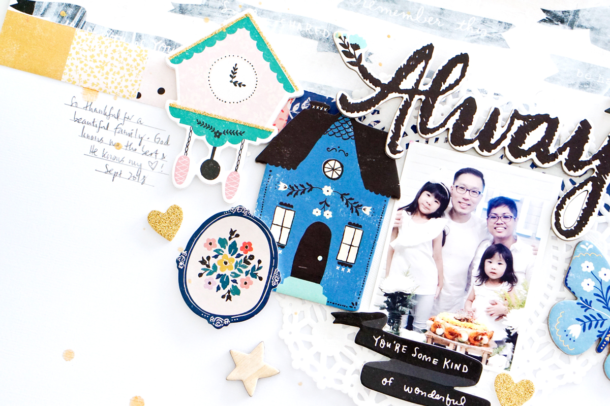
Hi friends! We have a lovely new scrapbook page for you today from design team member, Jessy. She pulled a lot of the blue elements from Willow Lane to use on her page and I love how it turned out! I have to admit that the blue in this collection was a game changer for me! It really made everything else come to life and it became one of my favorite elements to the line as the collection evolved! Lots of times we worry about everything matching and blending in, but when it comes to design (whether in scrapbooking, fashion or home decor) I usually find that the quirky contrasting accent color makes all the difference! Just remember, you don’t need it in big doses, just a little touch here or there is the perfect amount to keep things alive and interesting! Hello again! Today I would like to share with you a layout I created using shades of blue with a hint of of other colors that I scouted around in Maggie Holmes’ Willow Lane collection. With this color family theme in mind, the shades of blue sure created a warm and cozy feel to my layout. Well, I have […]
Maggie Holmes